Challenge
Preserve founding values amidst rapid growth
From their first day in business together, Jim Woodson and Harold Holmes could feel that they were on to something big. It was Frontier Days in Cheyenne, Wyoming, and they had barely managed to get John Turner’s tiny pre-fab “Taco House” up and running in time for the festivities, yet customers were already lined up for this (then) exotic fare. Success bred success, and by their third location, there was no turning back: in 1969, Jim and Harold bought the franchise rights and named the business Taco John’s. Over the next half-century, they helped create over 400 “West-Mex” restaurants across nearly 30 states.
Their compassion for their franchisees and their employees back at HQ always made the company feel like one big, extended family, and those values continue to underpin the company today.
With its 50th anniversary on the horizon, the current leaders of Taco John’s wanted to capture its proud history in a book for three reasons: to help them recruit and onboard the right franchisees; to deepen the abiding loyalty of current franchise owners; and to commemorate the hard work, daring risks, and enduring values of the founding families.


Solution
Spend time with the founders, get the story right
In tackling a story like this, we rely heavily on the memories of the people involved (or their children and grandchildren), and on records and archives. The Taco John’s book benefitted from a wealth of detail in both areas. In interviews, family members and long-term employees told stories that had been passed down by word of mouth about the culture of this unique company. Truly special were the incredible insights shared by Harold’s widow, Nona Holmes, the last surviving founder.
On the archive front, we were thrilled to learn that the archivists at Taco John’s had already catalogued and preserved artifacts across the company’s 50 year history. Taco John’s is such a well-loved brand throughout the West that Laramie University had created a public archive of their work, including employee photos, company records, packaging, advertisements, and other ephemera. All of that vibrant visual texture was designed into the book and it’s one of our favourites because of it.
Result
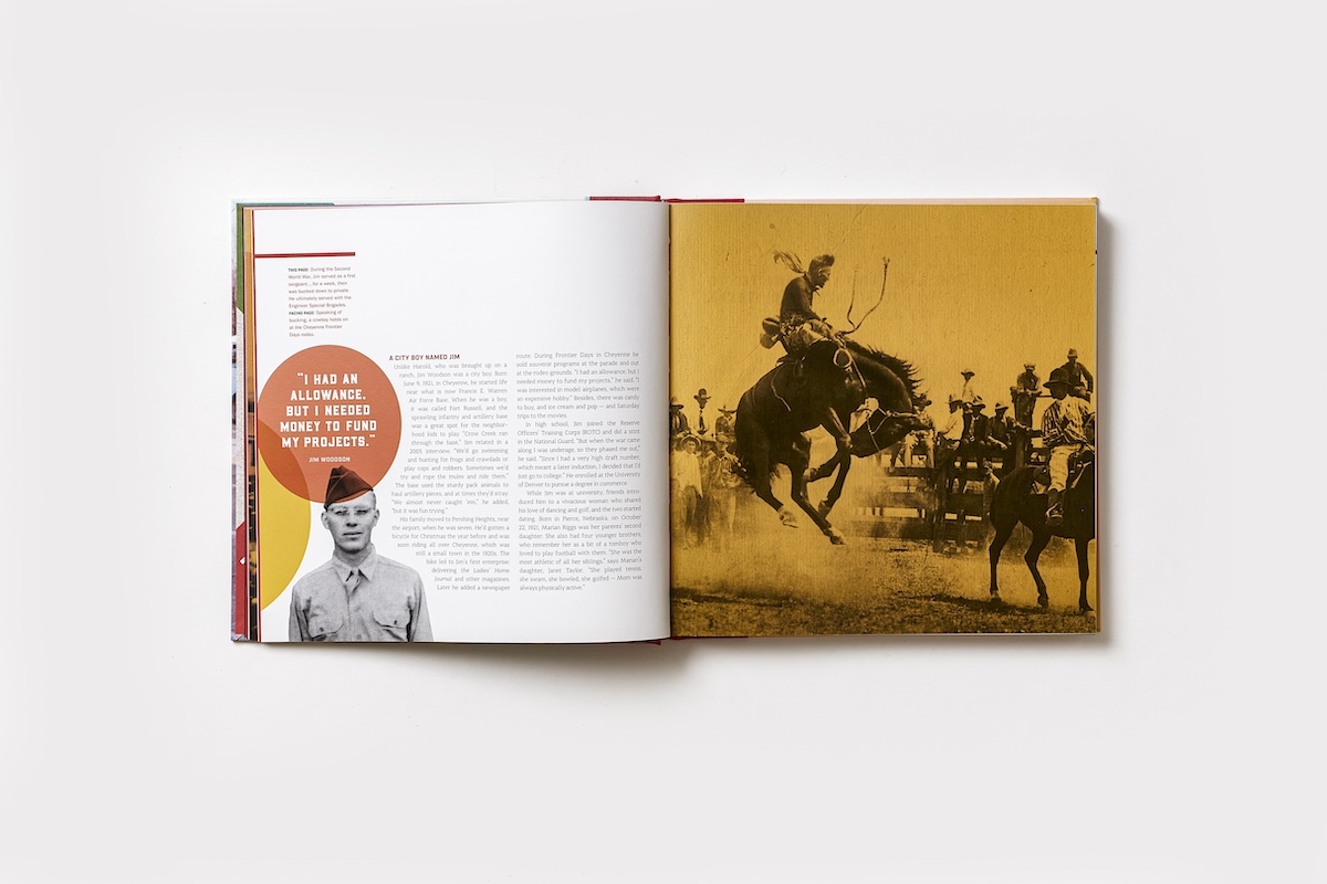
A company history piece filled with vivid archival photos and great stories
The finished book is one of our favourites from the bookshelf. Our team worked hard to write and design it in keeping with the Taco John’s brand so that in tone and look it feels like it belongs, and on every page honours the legacy and vision of the four founders. The team at Taco John’s trusted us to get that right, gave us everything we could possibly need, and we — like them — couldn’t be happier with the result. Truly, the outcome that matters most to us is captured in this photo, showing Taco John’s president Jim Creel presenting co-founder Nona Holmes with the completed book.
ONE MORE COOL THING...
Enter a new ECHO process
This project marked the debut of a design exercise led by our art director that has become an integral (and well-loved) part of our kickoff process.


